

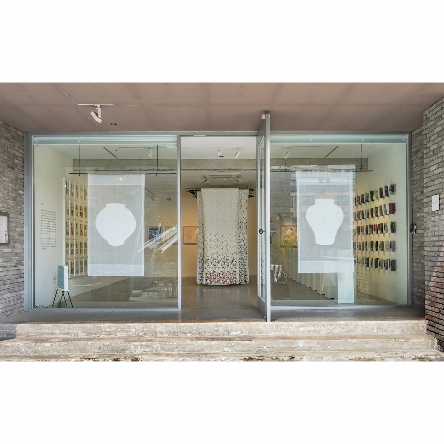
Sounds Hannam 2022
FLOW
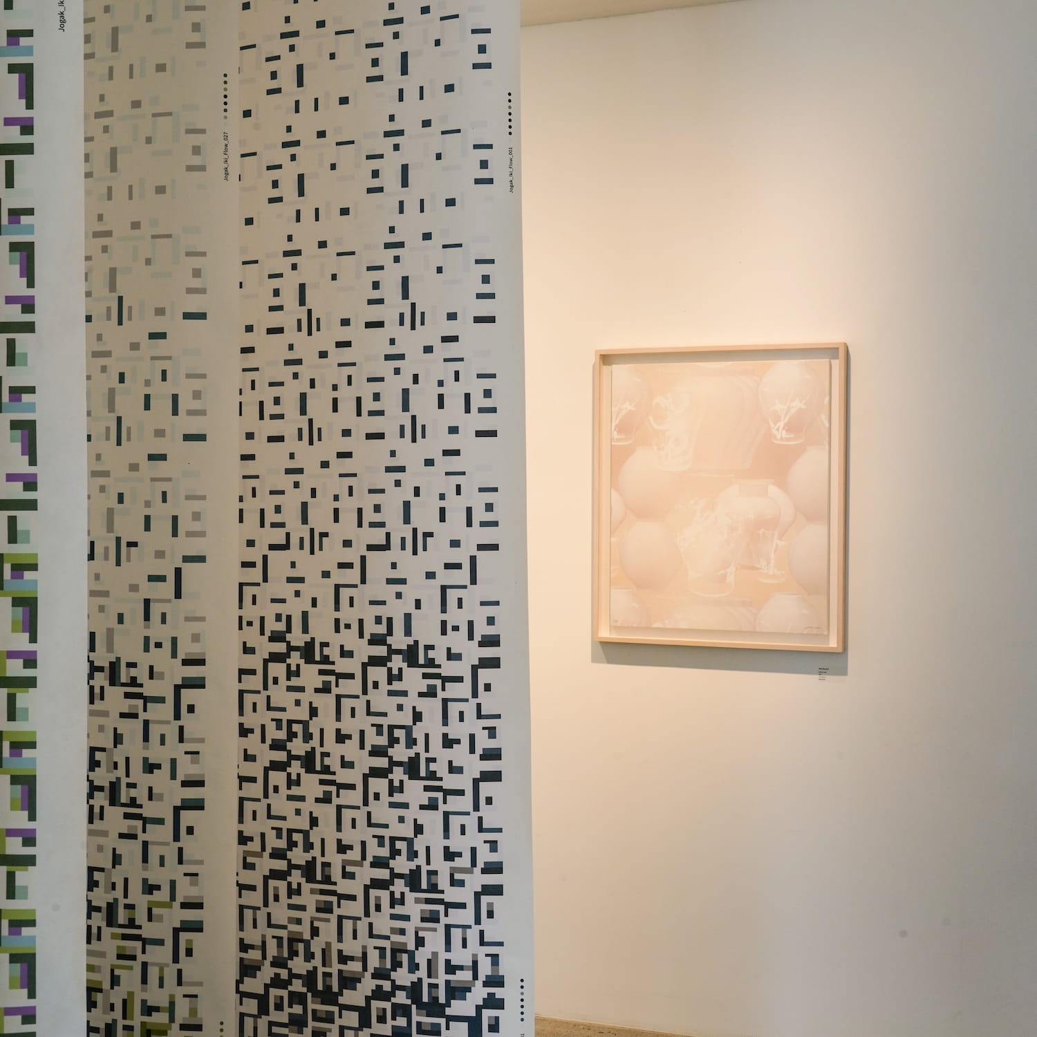
As a designer, the concept of ‘trend’ is very important to me, as my job involves making things in accordance with the character of the upcoming trend. I decided to create my own color palette by recording what I saw around me and editing it so as to connect with my other concerns. Within the concept of trend, images are usually mass-produced and have a short lifespan, and become just a means of artistic play. Instead, I began the process of forming an intimate relationship with the color and the texture of materials that brings tactile proximity based on natural beauty derived from the precious resources I obtained directly from nature. The work of separating and connecting materials that react and affect one differently depending on texture, physicality, light, and technology, combined with an interest in the meaning of color symbols, history, and tradition, which created a deeper narrative by overlapping time and space at different levels.
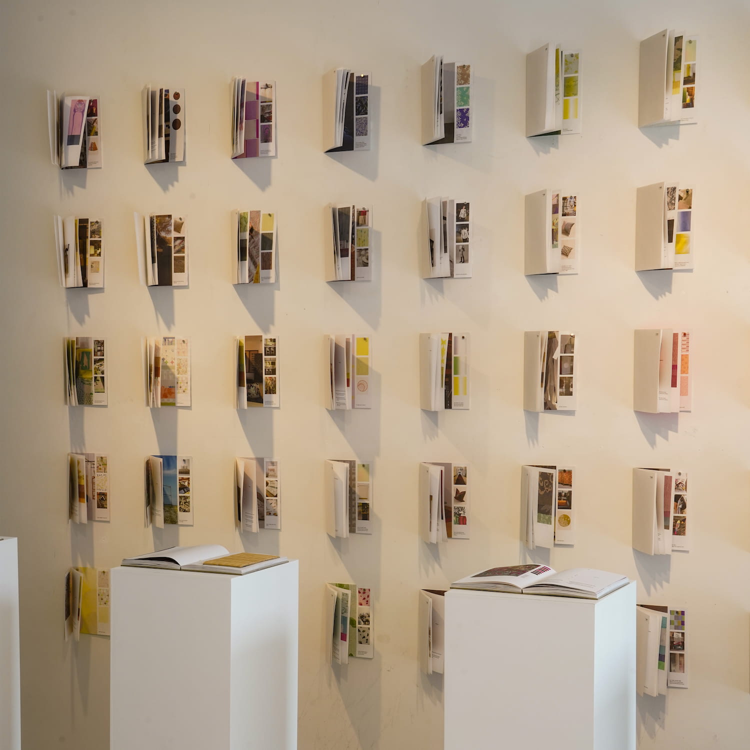
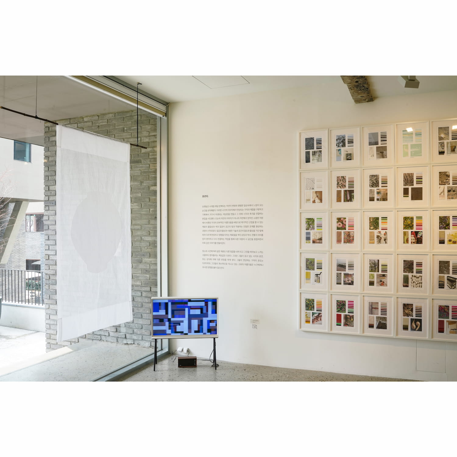
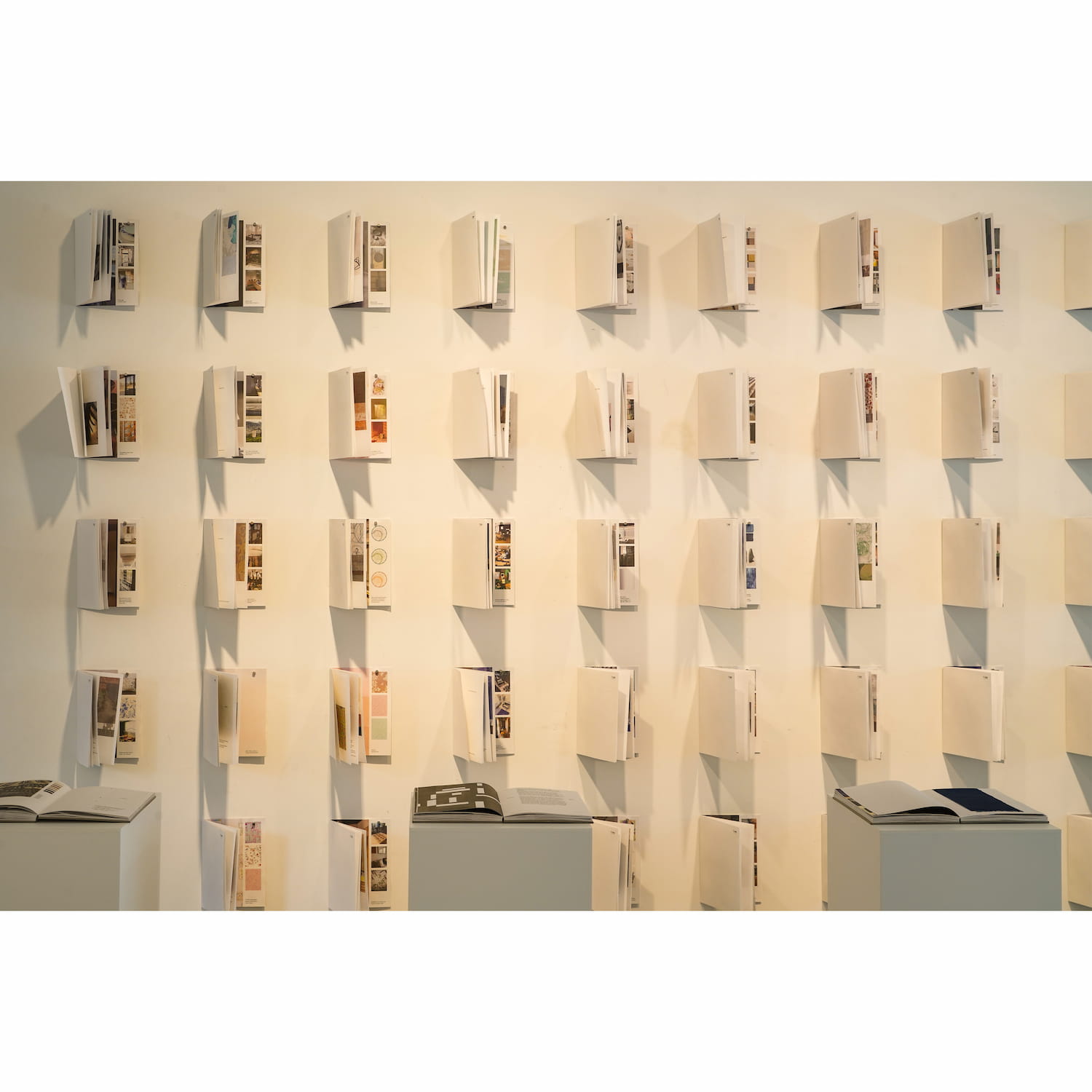
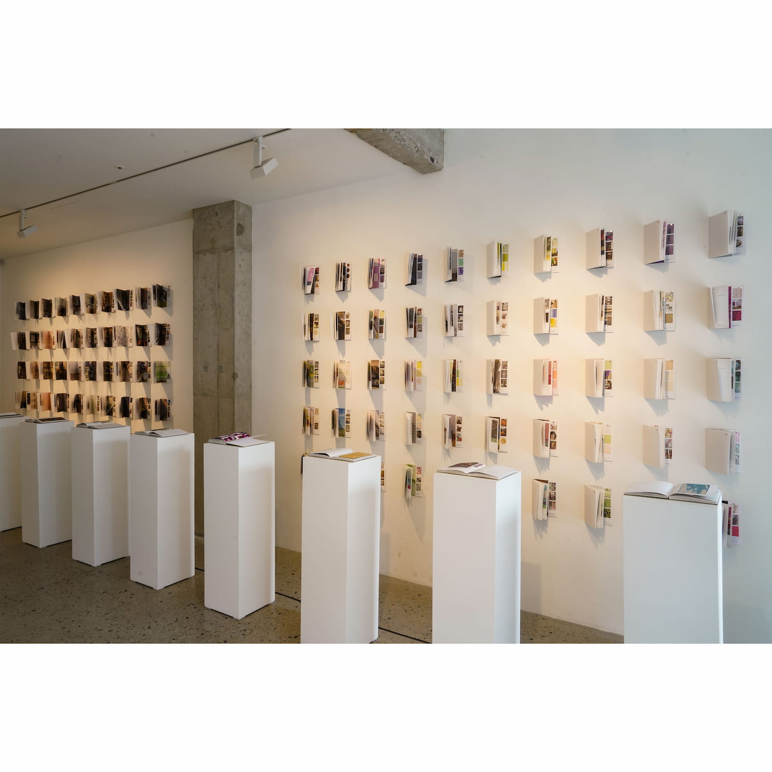
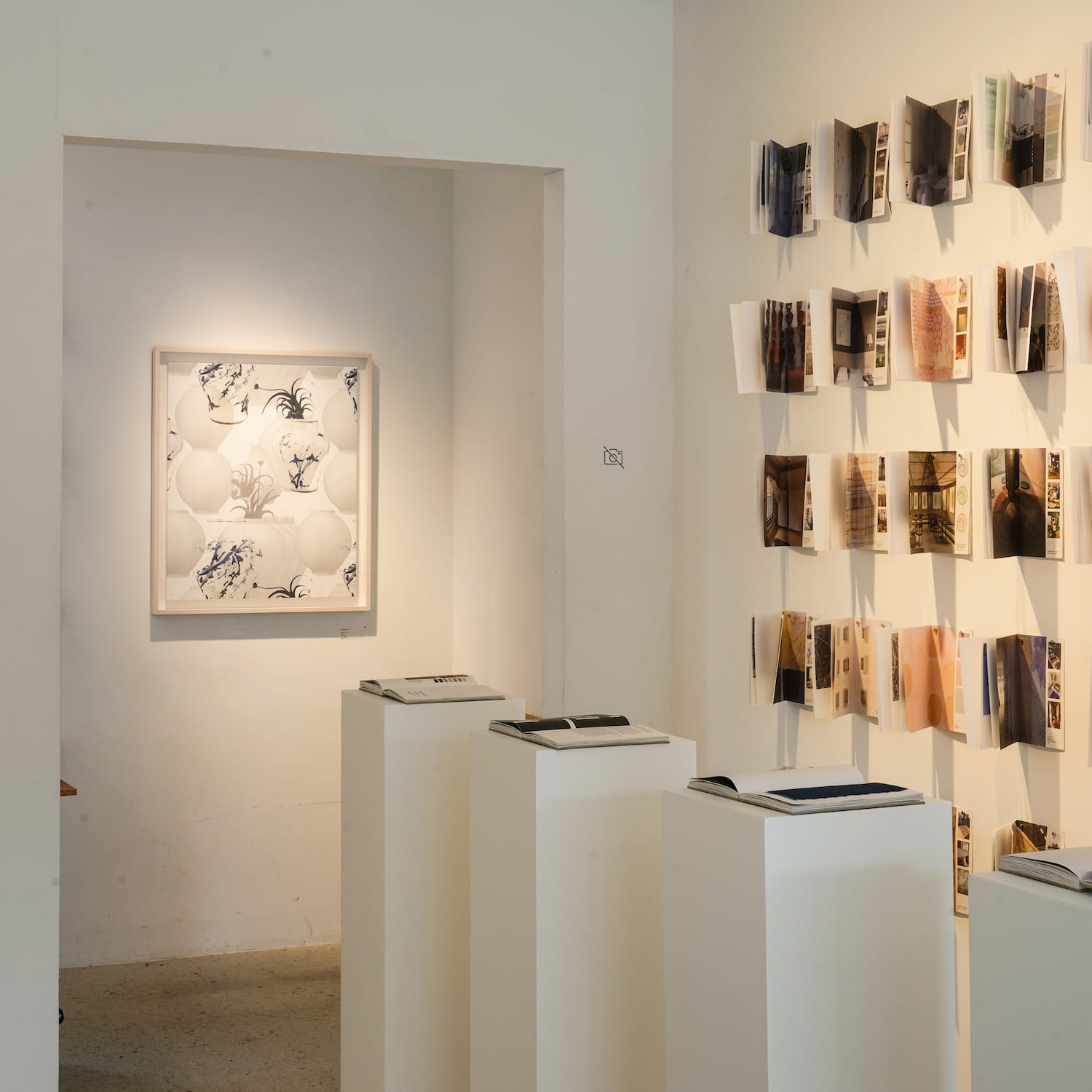
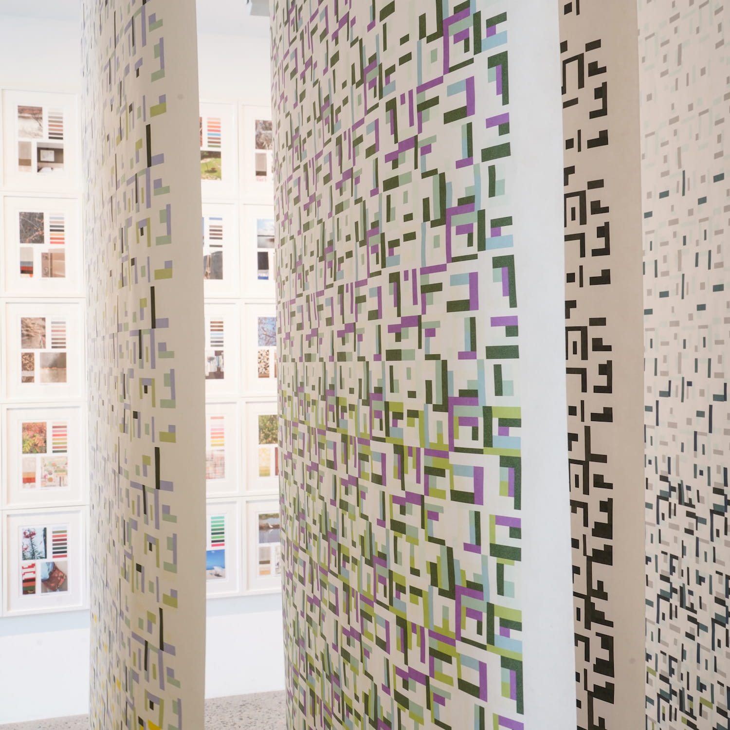
Over the twelve months of the year, the four seasons were captured intuitively in everyday life using a digital camera. Depending on the place and time of year, the same raw material sources produced different colors. The colors in the digital image were then extracted as a way of recording and storing unconscious color values. As if planting invisible seeds, I recorded time and memory together, keeping the images for a long time, then taking them out, repeatedly reminiscing and reconsidering, and slowly ordering them into a color ‘palette’. Each color in the ‘palette’ is linked to a specific natural motif, and the data is organized so it can inspire new designs and bring unexpected results. I found the process was not artificial, and instead was like an excavation of natural beauty.
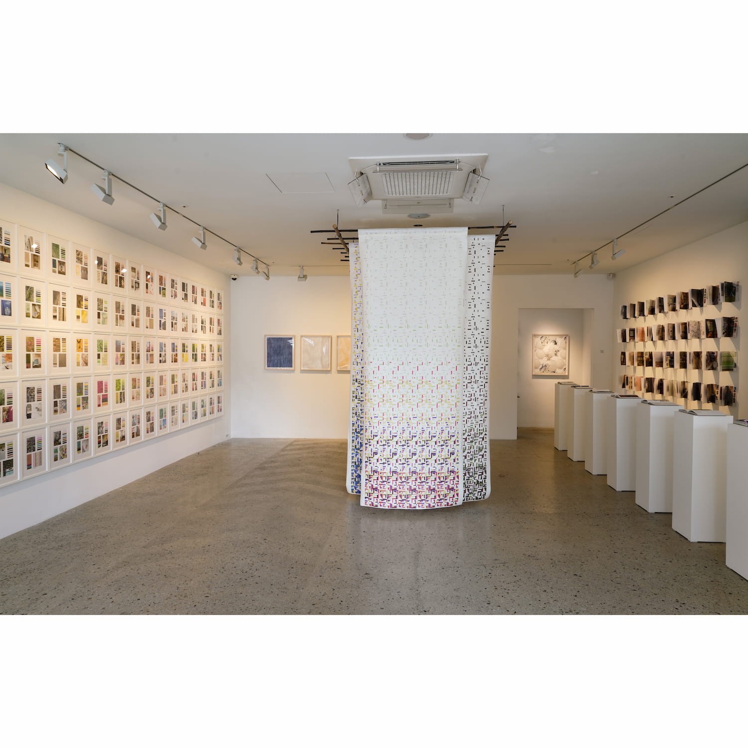
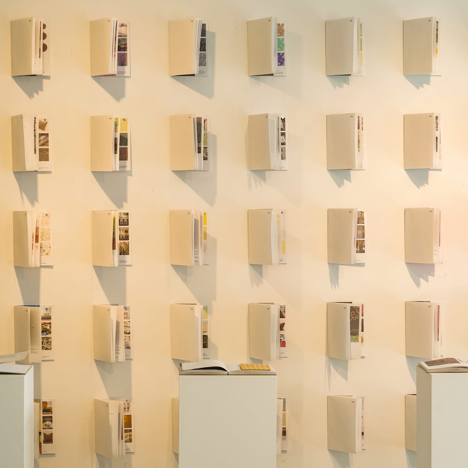
An archival book was eventually completed with images from nature, color palettes, color value charts, and images of time and space reminiscent of memories, texts and patterns explaining them, as well as materials such as wallpaper and fabric to give the color a tactile dimension. As part of the underlying work of branding, I applied this archive and used it for various projects, edited the data, and started various material records using bookbinding techniques.
Based on these resources, countless applications could be made, and it was surprising to find the result as constituting a kind of ‘borrowed landscape’. The color value that each person sees and feels is different. They react differently according to their viewpoint and prejudices, or their common sense. The sense of inherent beauty they possess implicitly, even if the ‘temperature’ of their memories is somewhat different, resonates similarly for everyone. This exhibition was presented in the hope that it could encourage visitors to form their own taste through looking at nature with their own eyes, and by training themselves through direct visual and tactile experience.